First Digital Trust Ltd (FDT) is a trusted fintech company offering high-quality custody services for digital assets. Optimize your finances with our specialized platform that seamlessly bridges traditional and digital financial ecosystems.
We launched a client portal called "SmarTrust". I'm implementing a new "Overview" feature for version 2.1, which will provide a quick account summary upon login to improve user experience.
Licensed by First Digital Trust Ltd.
------------------------
Skills: Market research . Branding . Design thinking . Design management . Problem solving . UXUI design . Responsive website
Tools: Figma . FigJam . Miro . Confluence . Jira
The product - Client Portal
Manage your accounts and services securely and easily with the FDT Client Portal, so wherever you are, you know exactly where you stand.
--------
The problem
Clients and account managers report that users cannot access essential information, such as the total number of companies, total assets, recent transactions, and their statuses. The process is frustrating due to tedious steps, repeated keystrokes, and bugs, along with a lack of compatibility between the platform, website, and app.
--------
The goal
1. Introduce a new "Overview" landing page upon login.
2. Display the total number of companies, total assets, balance, recent activity, and company statuses.
3. Allow users to switch between their associated companies.
4. Show recent actions in a new section.
Client interview
To understand FDT's client issues, I interviewed the head of back office operations and created empathy maps to identify user needs. A key user group highlighted concerns about the lack of summaries, excessive clicks for actions, and a difficult interface. While this confirmed my initial assumptions, the research also revealed additional issues affecting website visits, such as trade type problems, unclear account status, and no option to edit submitted actions.
--------
User pain points
1. No overall view, account summary
2. No notification feature
3. Time consumption - too many clicks per action, switch company
4. No email notification - difficult to know the ongoing process and status
5. Special needs - cannot download PDF, no customised input field
--------
Action plan
After gathering client feedback, we identified their needs and pain points. We aligned our business goals and resources with stakeholders and the head of product.
1. Research/Review: Collaborate with the head of product, project manager, and stakeholders to analyze user feedback, competitor studies, and market research.
2. Persona & KYC Study: Redefine user persona, journey, wireframes, and user flow.
3. Review Flowchart: Assess the current flowchart and streamline any steps.
4. New Framework: Redesign the page framework for cross-platform compatibility.
5. UX and UI: Create a new wireframe and design a fresh dashboard page with additional components.
6. Nice to Have: Improve the login page to ensure a smooth transition to the new process.
--------
Ideations and define
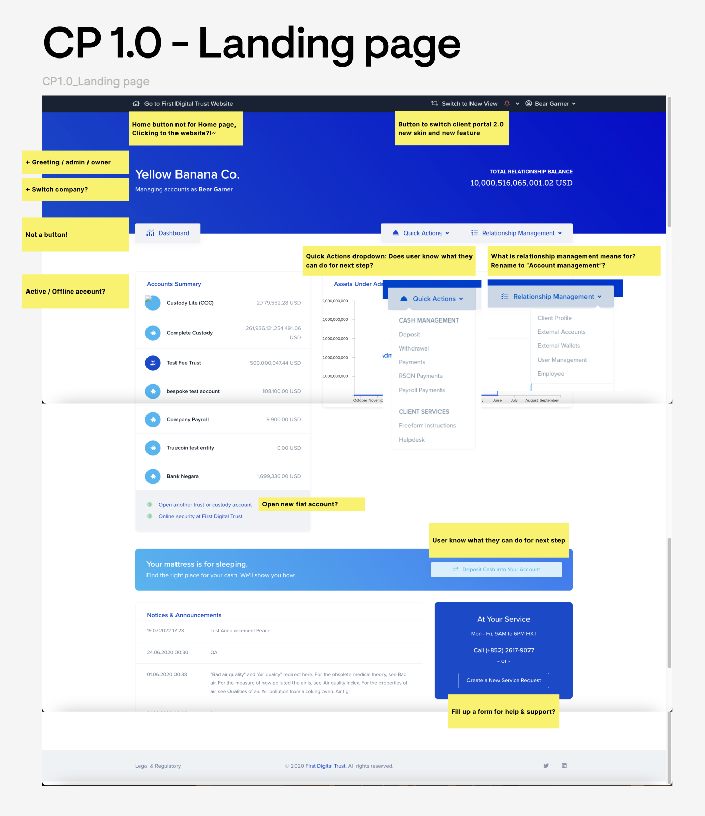

Action plan
1. Revamp the top navigation bar with a dropdown menu for new upcoming features, to replace the left navbar.
2. Split the center panel into a portfolio dashboard and a tabbed asset list.
3. Move client/company name to the top, and add greeting.
4. Include Account Index, Deposit and Withdrawal in the top section of the section panel.
5. Add "Deposit", "Withdrawal", "Transaction History"
6. Add "Helpdesk" sticky icon on bottom right.
7. Revamp the footer.
Sitemap and Navigation
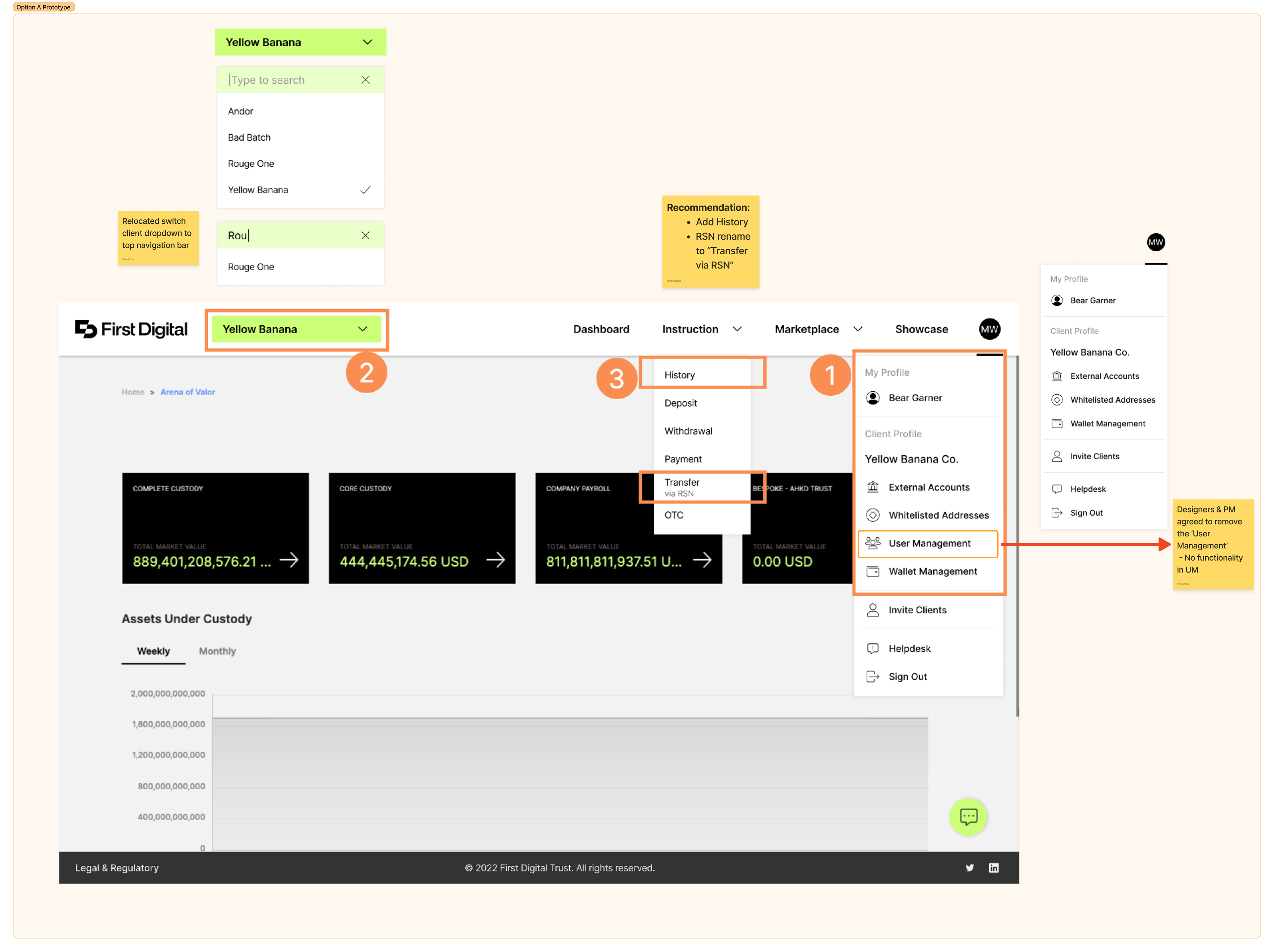
(Fig. 1 Right) The current CP2.0 sitemap shows ongoing navigation issues. I focused on enhancing website navigation through strategic information architecture with minimal Phase 1 changes.
Below is the updated sitemap (Fig. 2 Left) and improved top navigation (Fig. 3 Right) address issues such as switching between company accounts, unclear naming, and confusing structure, while differentiating user and company profiles without altering the back-end.

--------
⚠️ Wireframes and user flows encompass highly sensitive internal company information and will not be disclosed. ⚠️
--------
Mockups for website enhancement
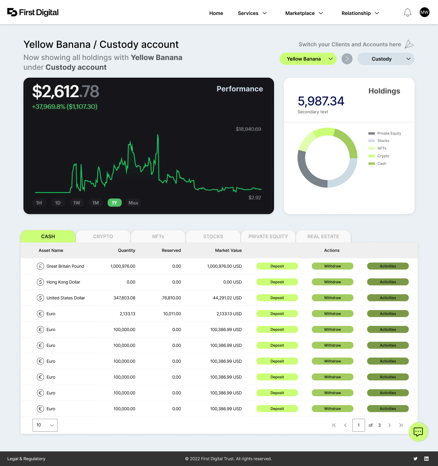
The redesign addresses user pain points and improves the overall experience by prioritizing relevant information based on asset types. A key strategy was the placement of diversity modules, with customized content tailored to users' industries, asset types, and functions.
Below is a six-month evolution of the dashboard design.

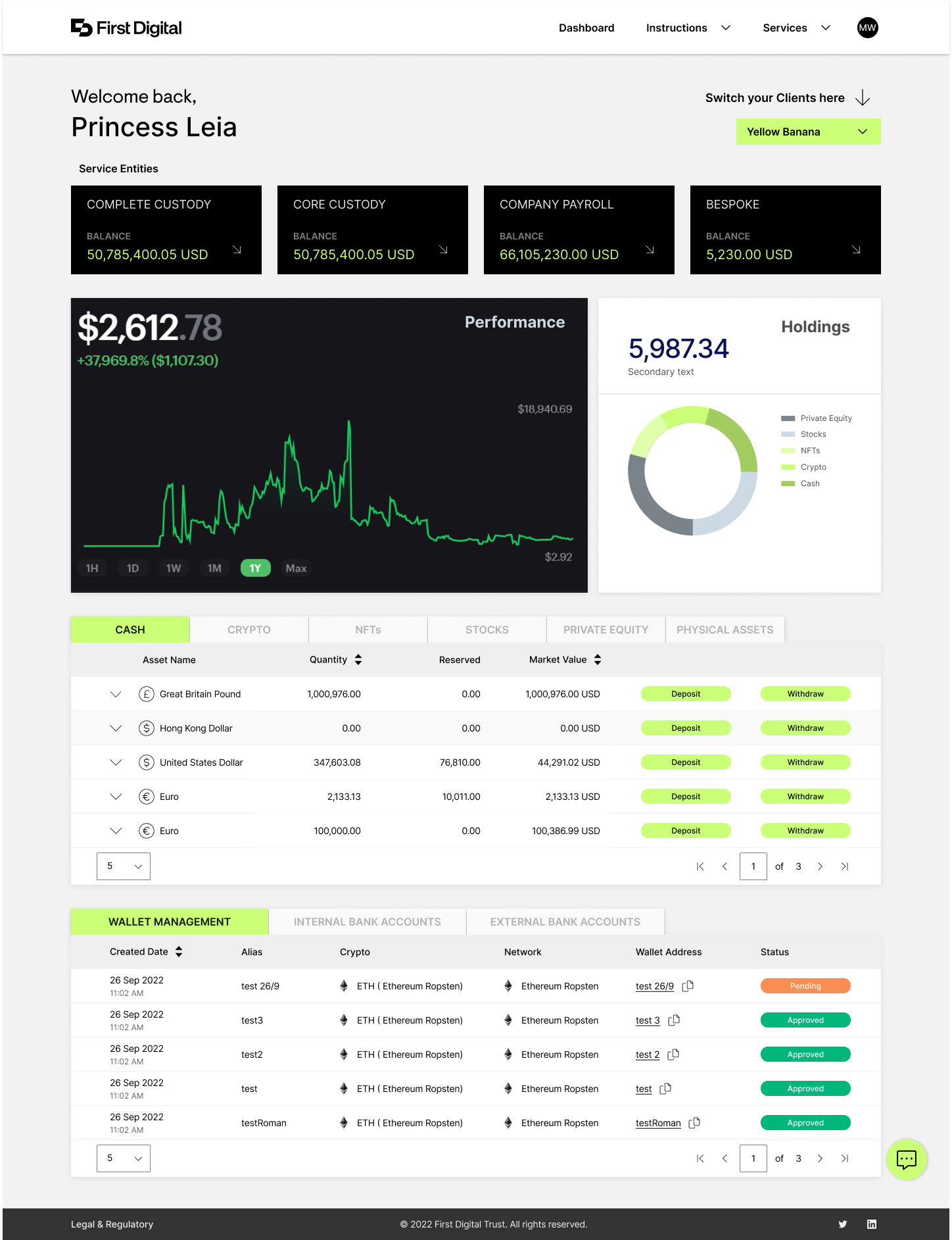


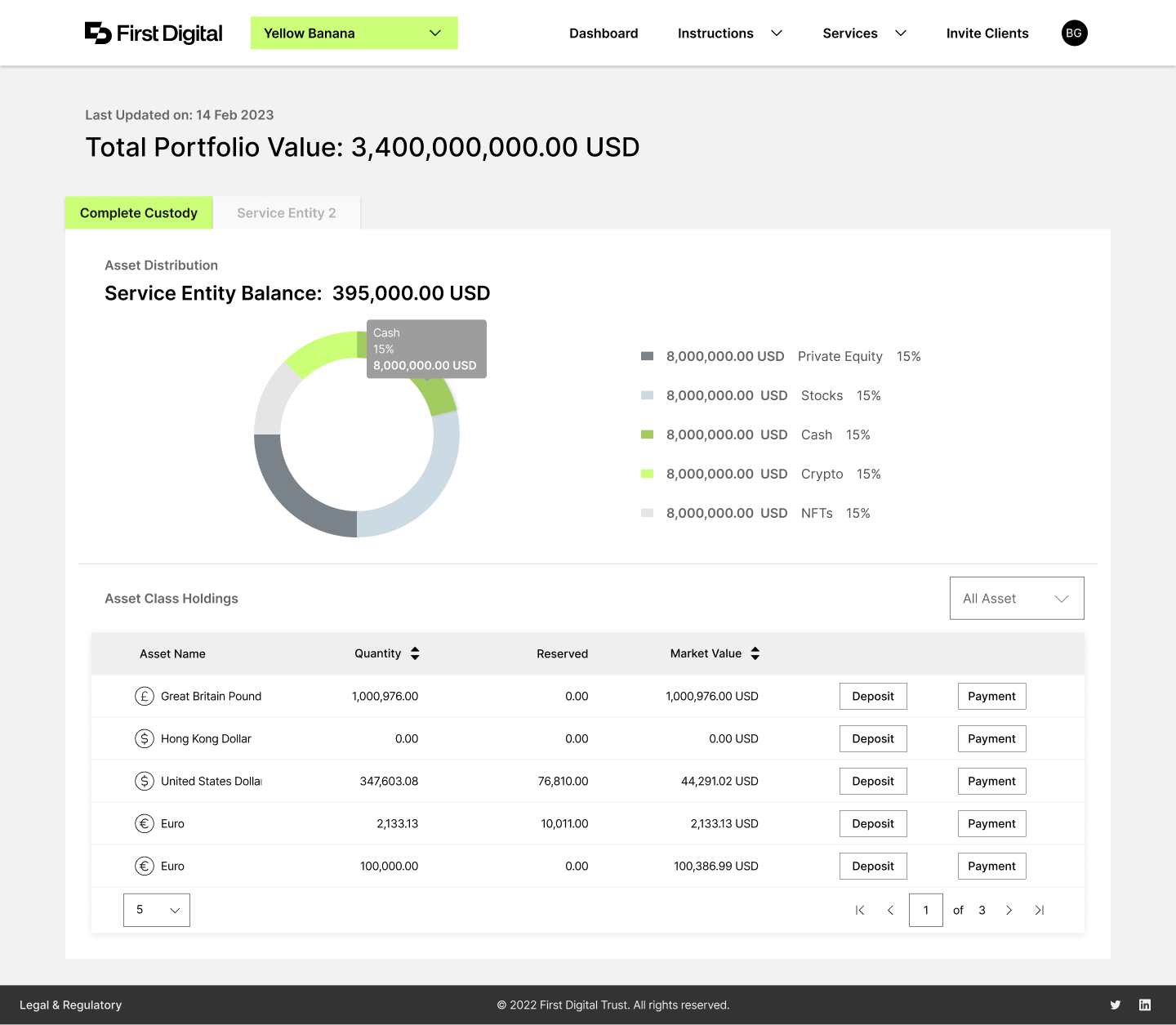
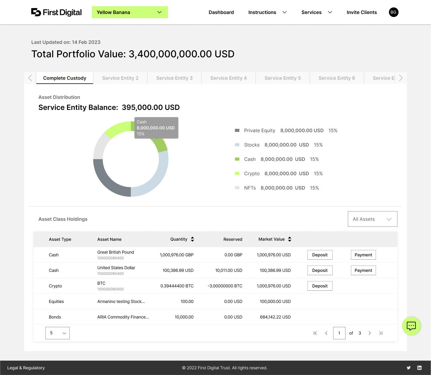
Frequent changes can harm the brand and make users suspicious of scams. Sending reminders or newsletters about updates can help alleviate these concerns. (Samples as below)
--------
Takeaways
Impact: A comprehensive view of assets is crucial. FDT has timely enhanced this feature to improve user experience.
What I learned: Gathering user feedback through interviews highlighted the importance of effectively applying this data, which influences the overall process. Despite ongoing changes, the key remains making the page user-friendly.
Please click here to experience the revamped website.